
Hotel Palm Royal Naha
Brand Refresh for Urban Resort in Okinawa, Japan
Modernising the urban resort hotel in the tropical island of Okinawa, Japan. Colours inspired by the unique local culture and graphics truly represent ‘Palm Royal’, the local heritage.

The Palm Royal symbol was created with palm shape combined with a crown graphic inspired by Ryukyu King. Okinawa prefecture was formerly known as Ryukyu Kingdom (琉球王国).
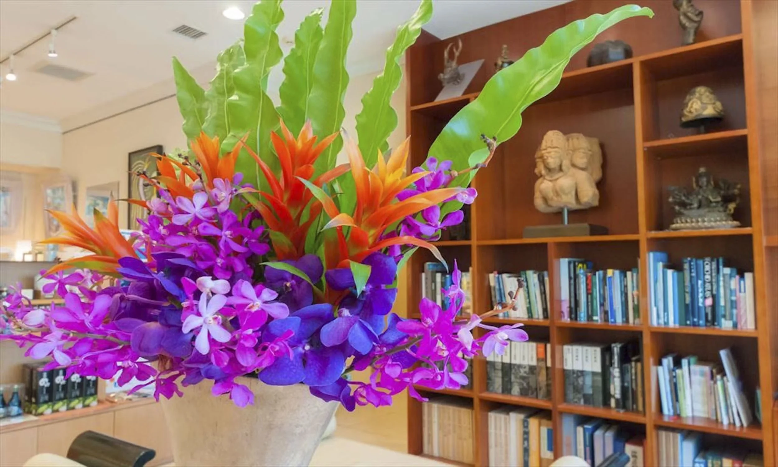
Colours inspired by the unique culture in Japan’s tropical island.
Revitalising the hotel brand to reflect its ethos
Hotel Palm Royal Naha’s ethos is 'hospitality with care and a welcoming environment', while championing the unique Okinawan culture.
Located in the heart of Naha City, the hotel is an urban oasis that offers cocktails and DJ nights by the poolside, along with its own art gallery.
To reflect their impeccable hospitality and contemporary approach, I have helped the brand refresh by optimising the logo, creating a locally inspired colour palette, designing graphic assets, and updating the typography that works in both Japanese and English, as well as simplified and traditional Chinese and Korean.
Visual Identity System & Guidelines
Logo Optimisation
Additional Colour Palette
Graphic Assets Creation
Multilingual Typography

Images courtesy of Hotel Palm Royal Naha
Visual System

Colour Palette
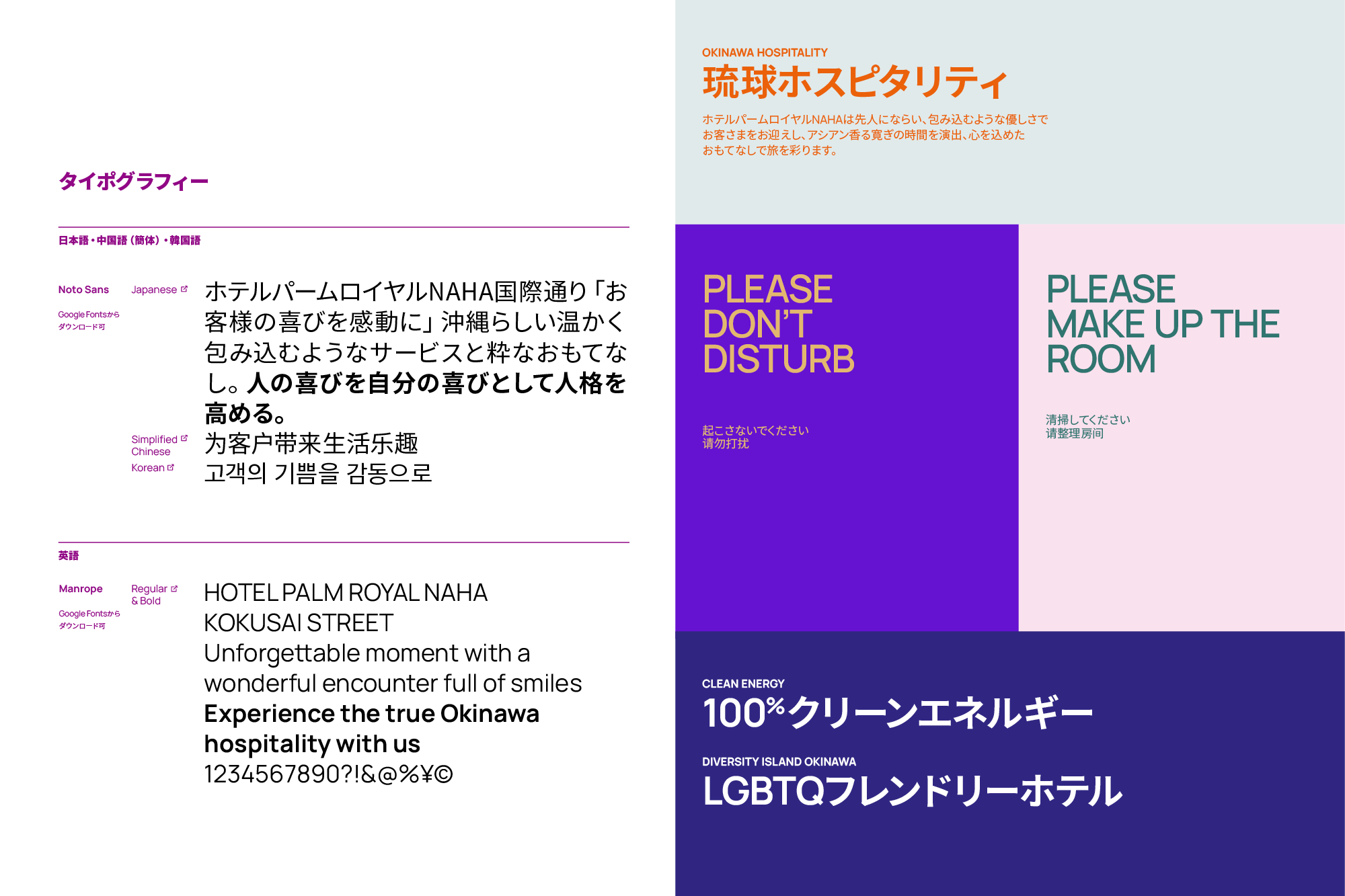
Multilingual Typography

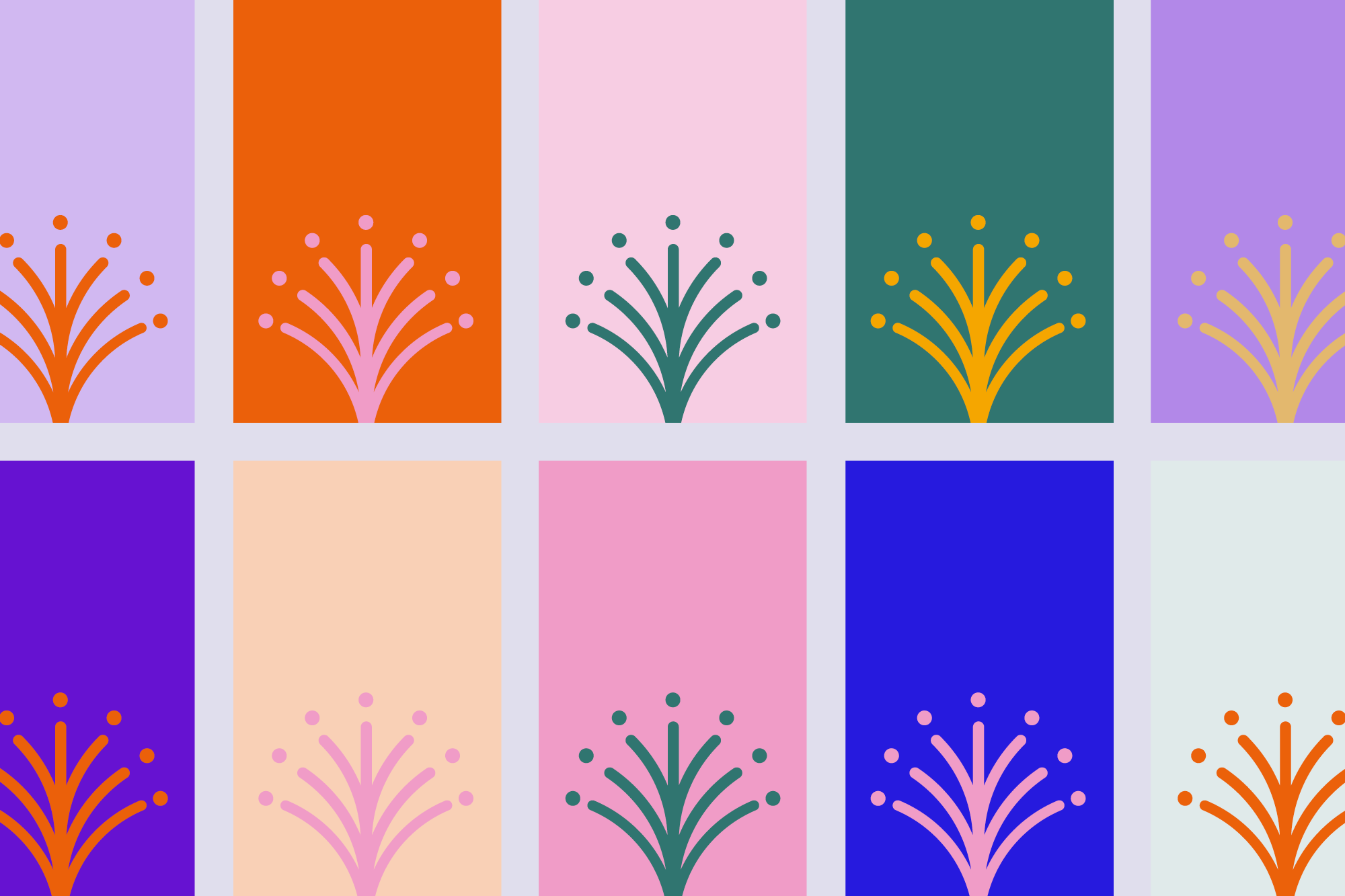
How the symbol is activated for contemporary applications

Palm Royal Symbol activation
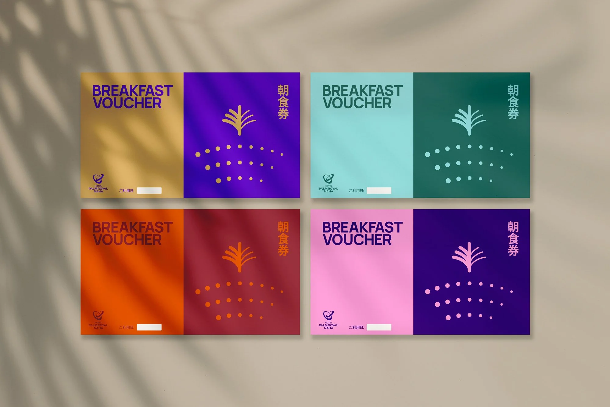
Breakfast Vouchers

Digital Signage
Graphic Asset

Letterhead

Carrier Bag

Welcome Card