Women in Art Fair Rebrand
Championing Women Artists Reshaping the Art
“Women artists are still treated differently from men.”
— Yoko Ono
Women in Art Fair (WIAF) was founded to change the imbalance in the art world. There are some shocking statistics:
Women artists in the UK earn around 40% less than men
Women artists make up just 13% of global auction sales
Just 32% of artists represented by London's top commercial galleries are women
WIAF exists to democratise art, empower emerging talent, and celebrate creativity in women by bringing together commercial galleries, collectors, curators, and institutions to engage directly with one of the art market’s most persistent distortions: the systemic undervaluation of women’s artistic practice.
But it has evolved into more than an art fair. It's a movement, an art prize, and a voice for creative health. The previous identity no longer reflected WIAF's growing authority in the art world
Strategic Foundation behind Design
Before touching any design tools, we established three core brand principles that would drive every creative decision:
Contemporary & Approachable
Emerging artists needed to see themselves in this brand. It couldn't feel exclusive, institutional, or intimidating. It needed to feel like a community championing their work.
Authoritative & Elegant
To shift the art world's attention and attract collectors, galleries, and press, WIAF needed visual gravitas with bold colours and clean san serif typography that signals trust.
Distinctive & Optimistic
The summer event needed to radiate energy, optimism, and celebration. We are the driving force for positive change for all women as well as an inclusive community.
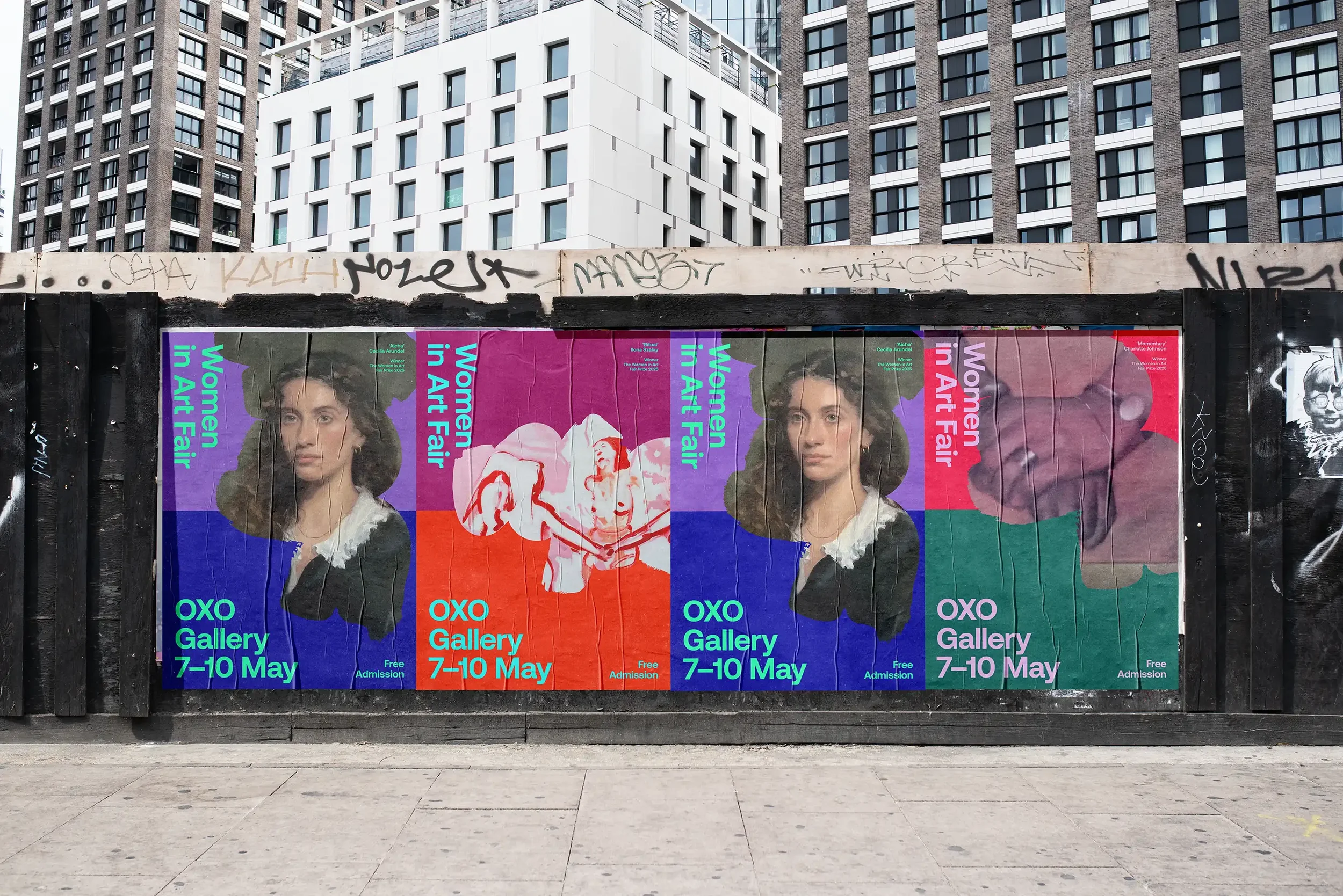
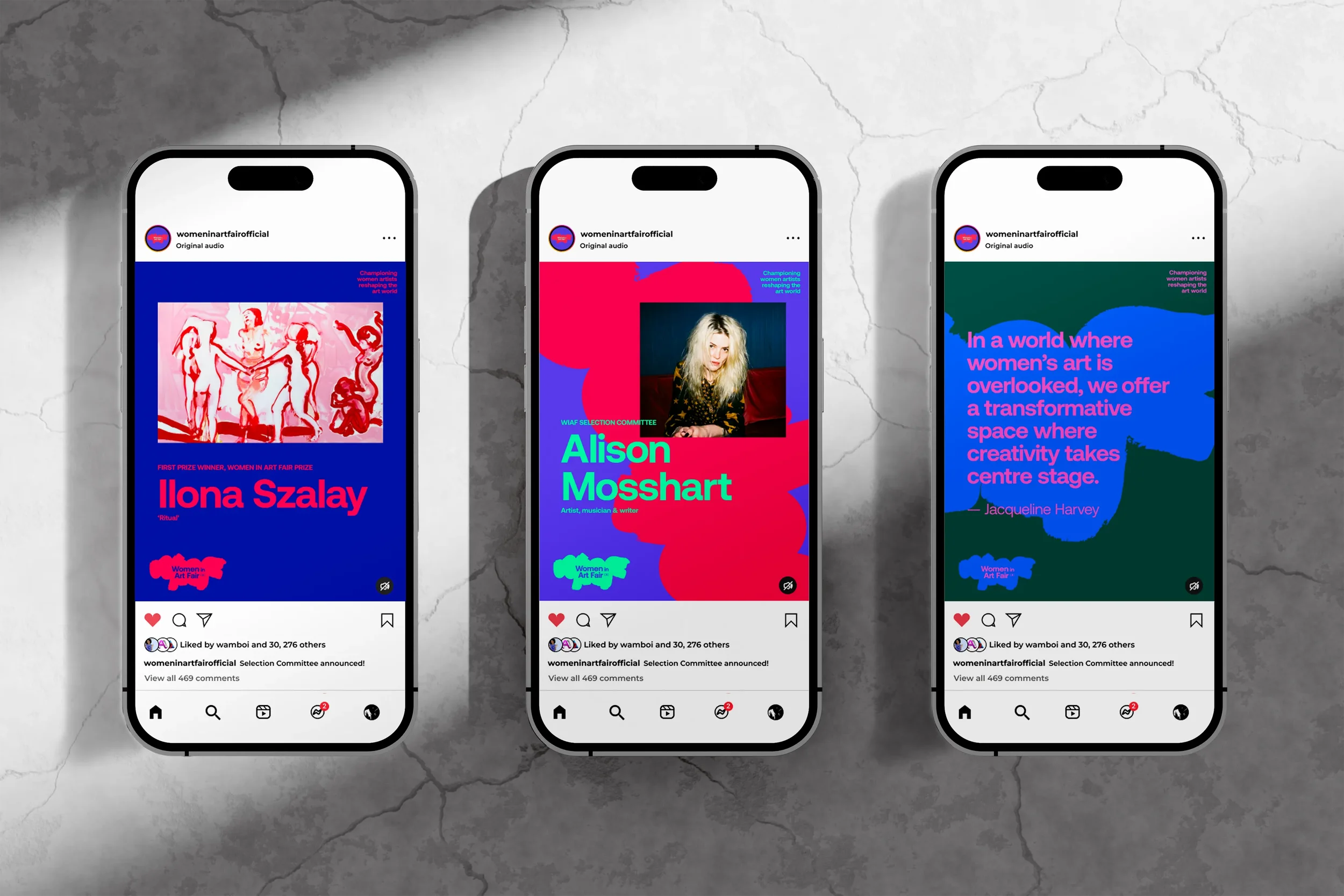
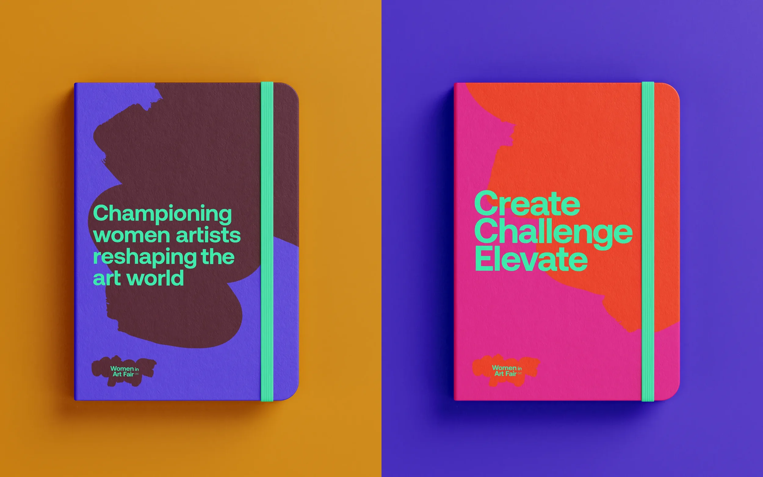
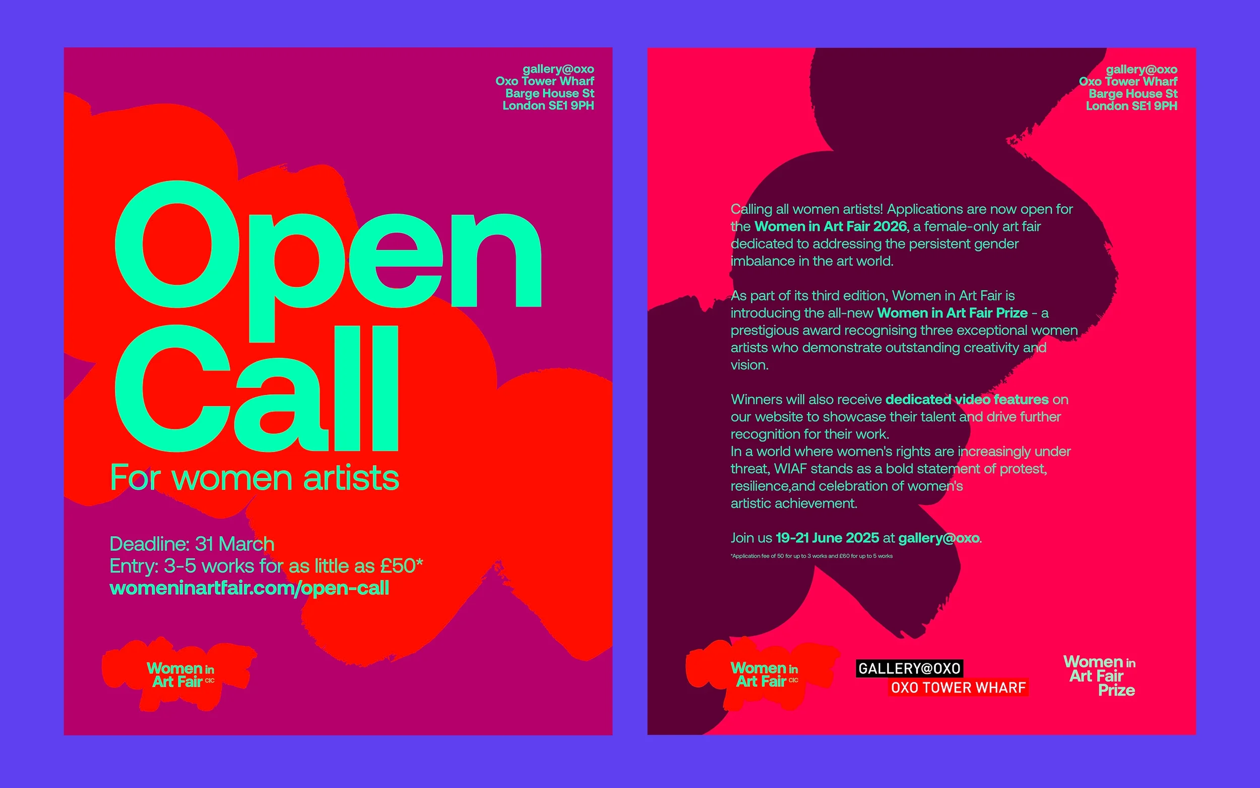
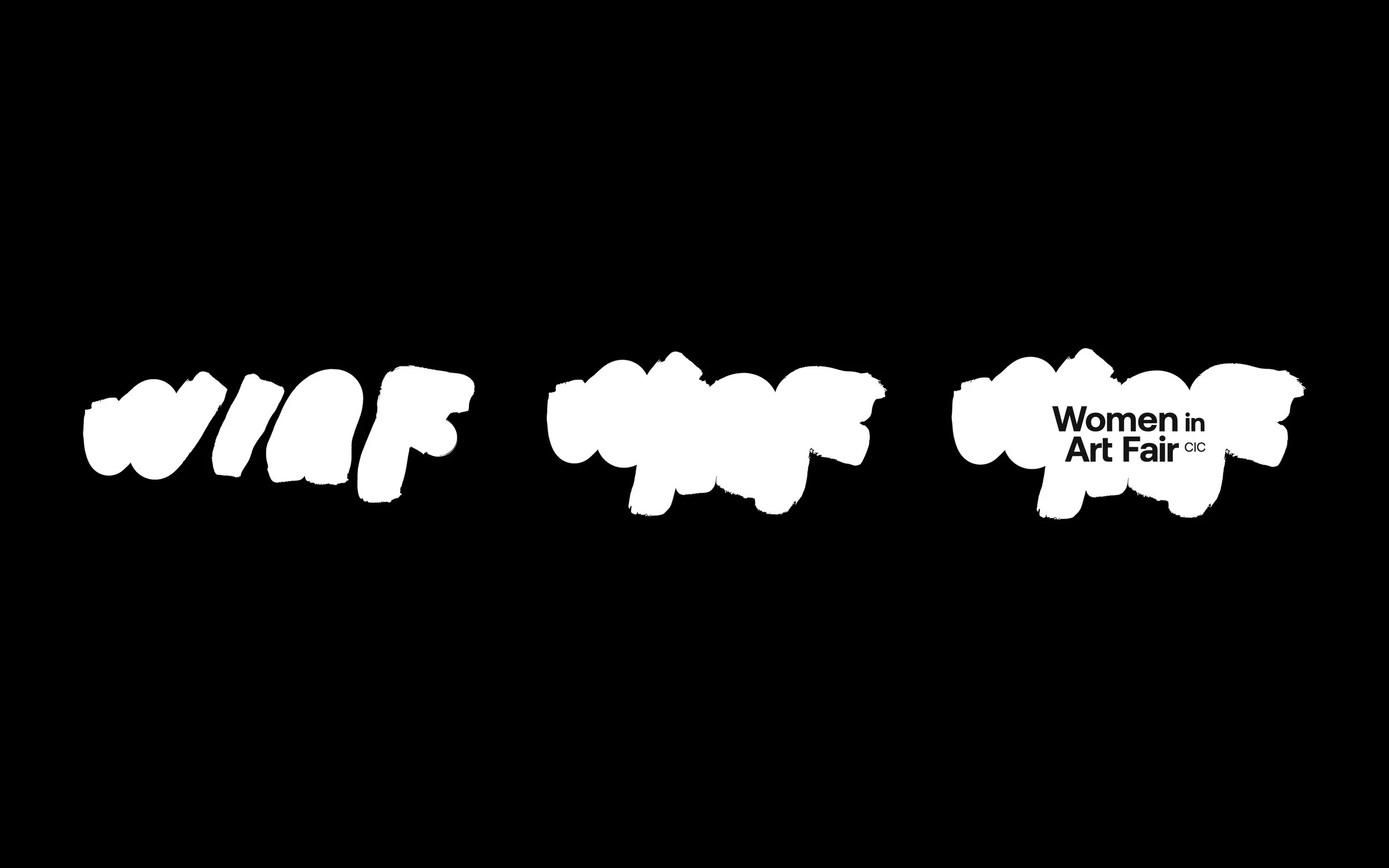
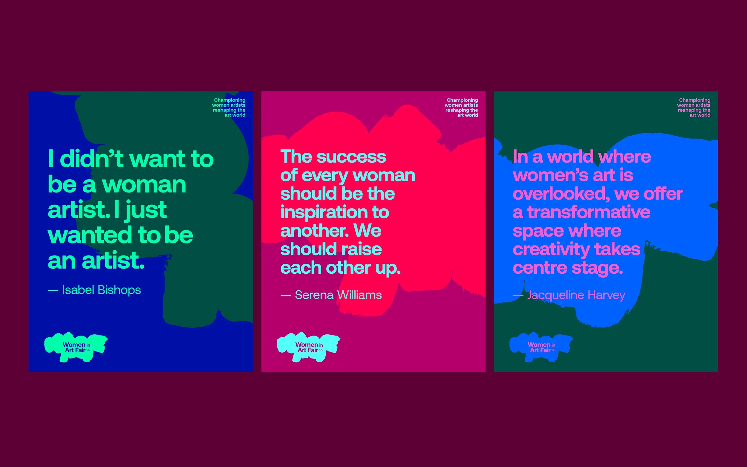
Brushstroke:
Voice Made Visible
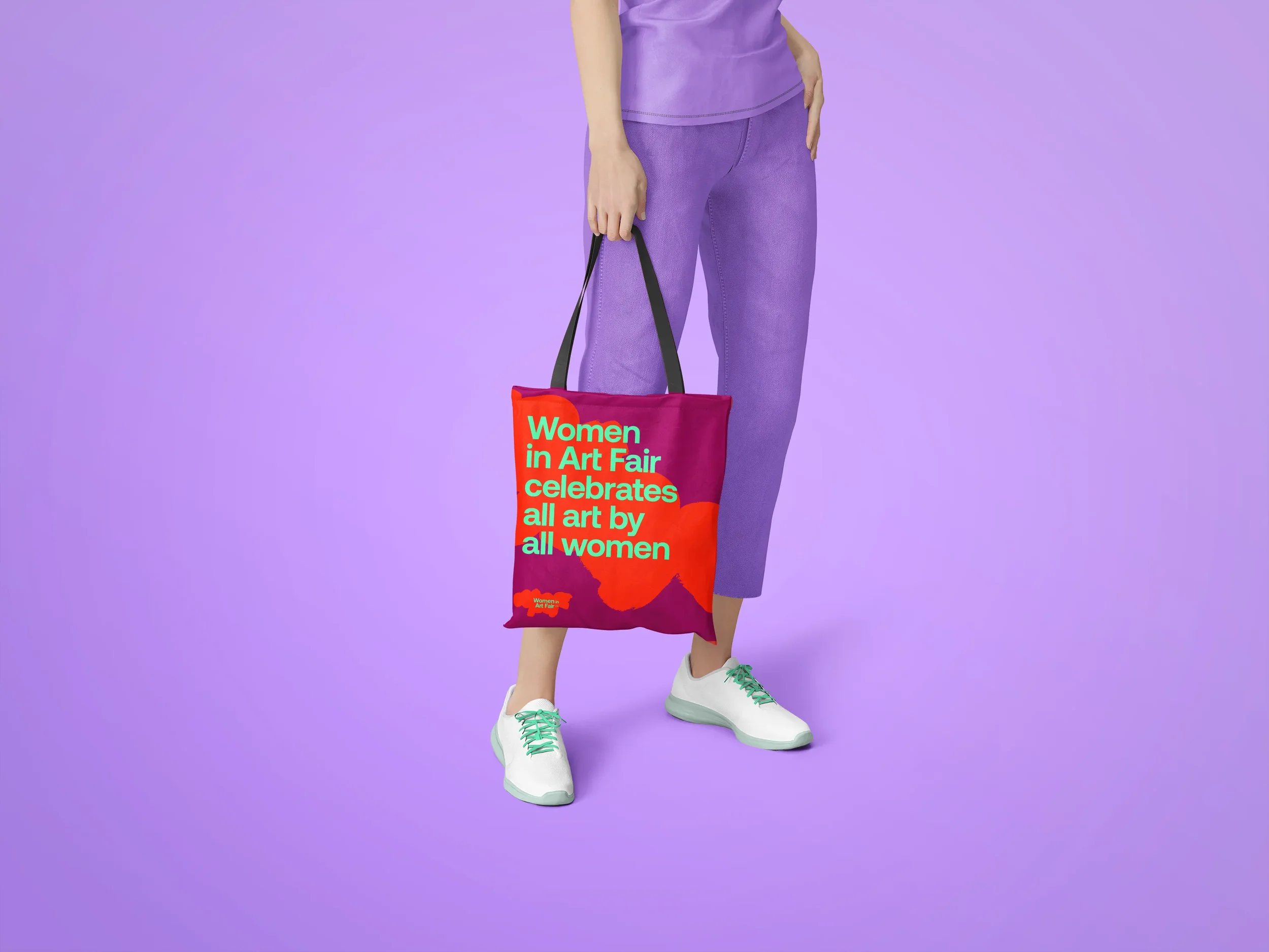
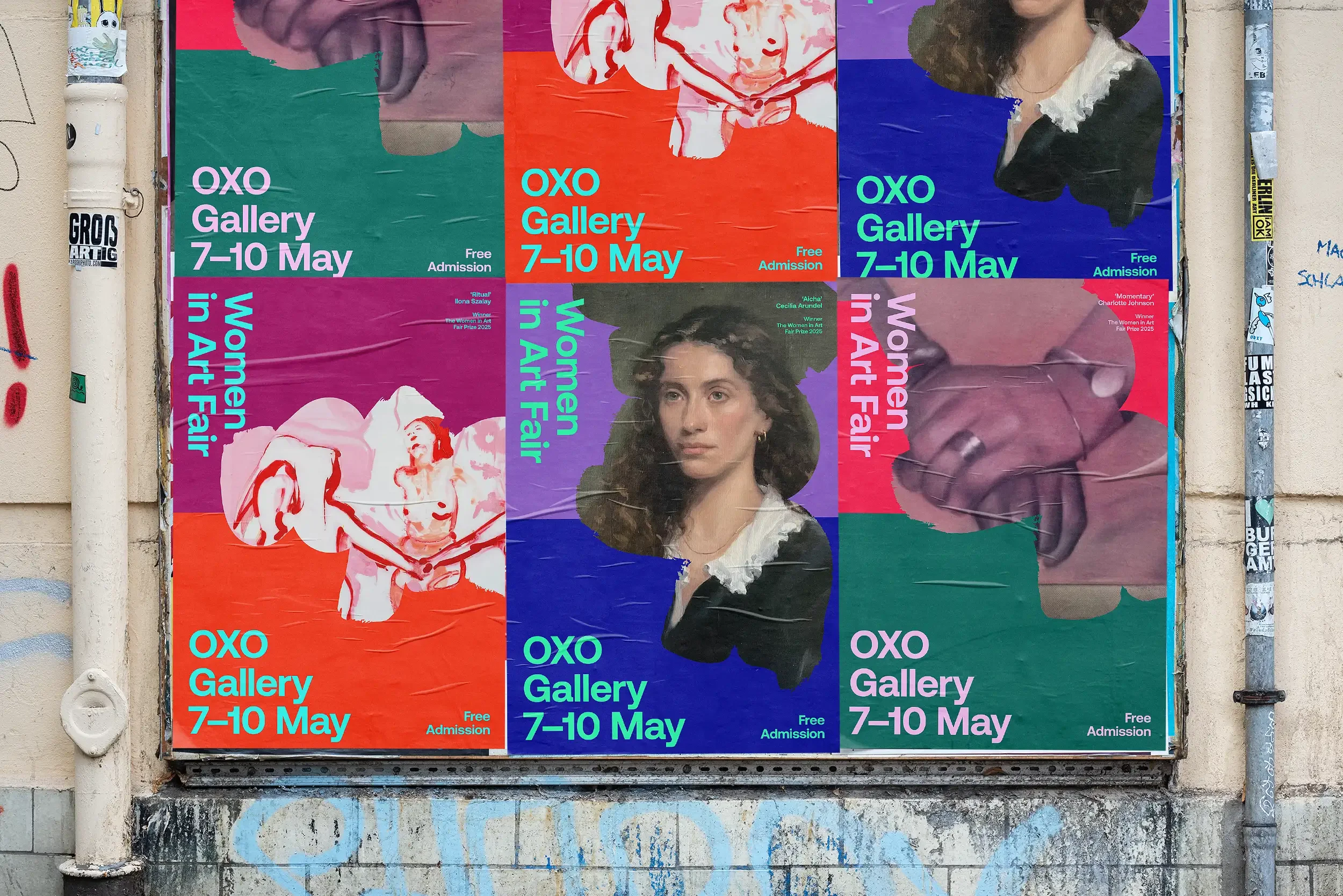
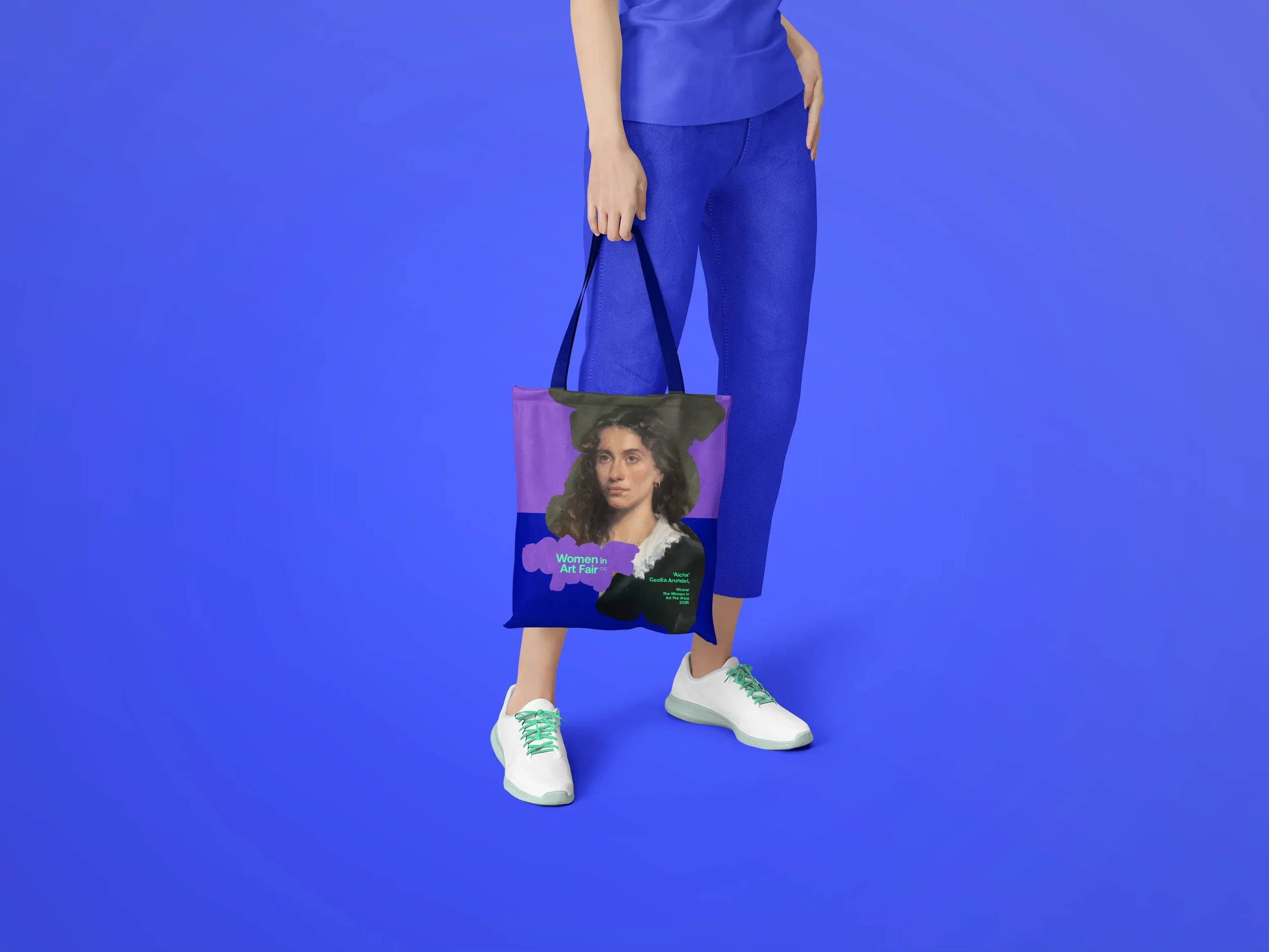
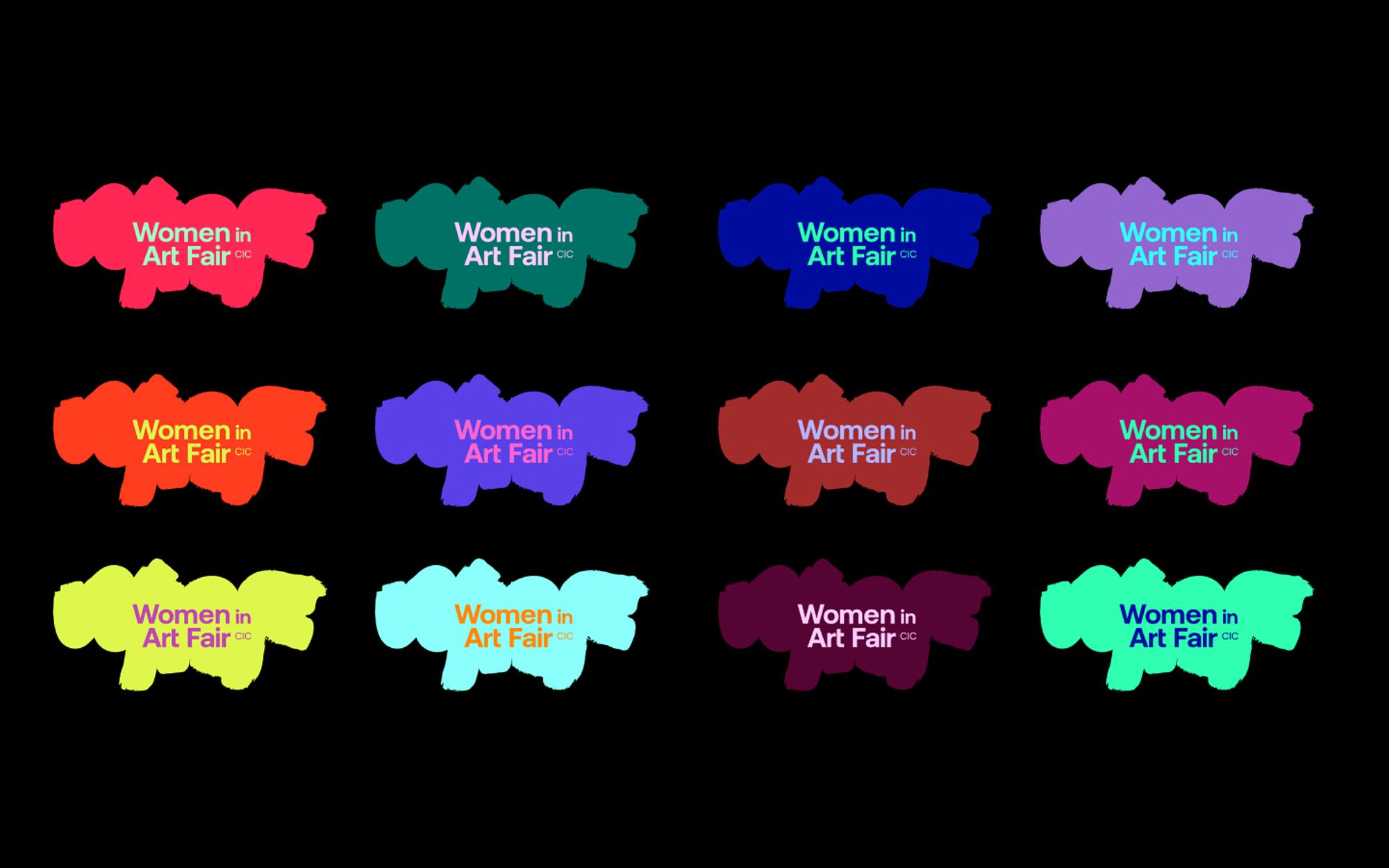
At the heart of the rebrand is an expressive “WIAF” brushstroke—dynamic, gestural, and unapologetically bold. The mark's organic, handcrafted quality feels immediate and human, celebrating the remarkable women around us. It's free and individual; the form can expand, contract, and repeat, creating an infinitely flexible visual language that never feels rigid or formulaic.
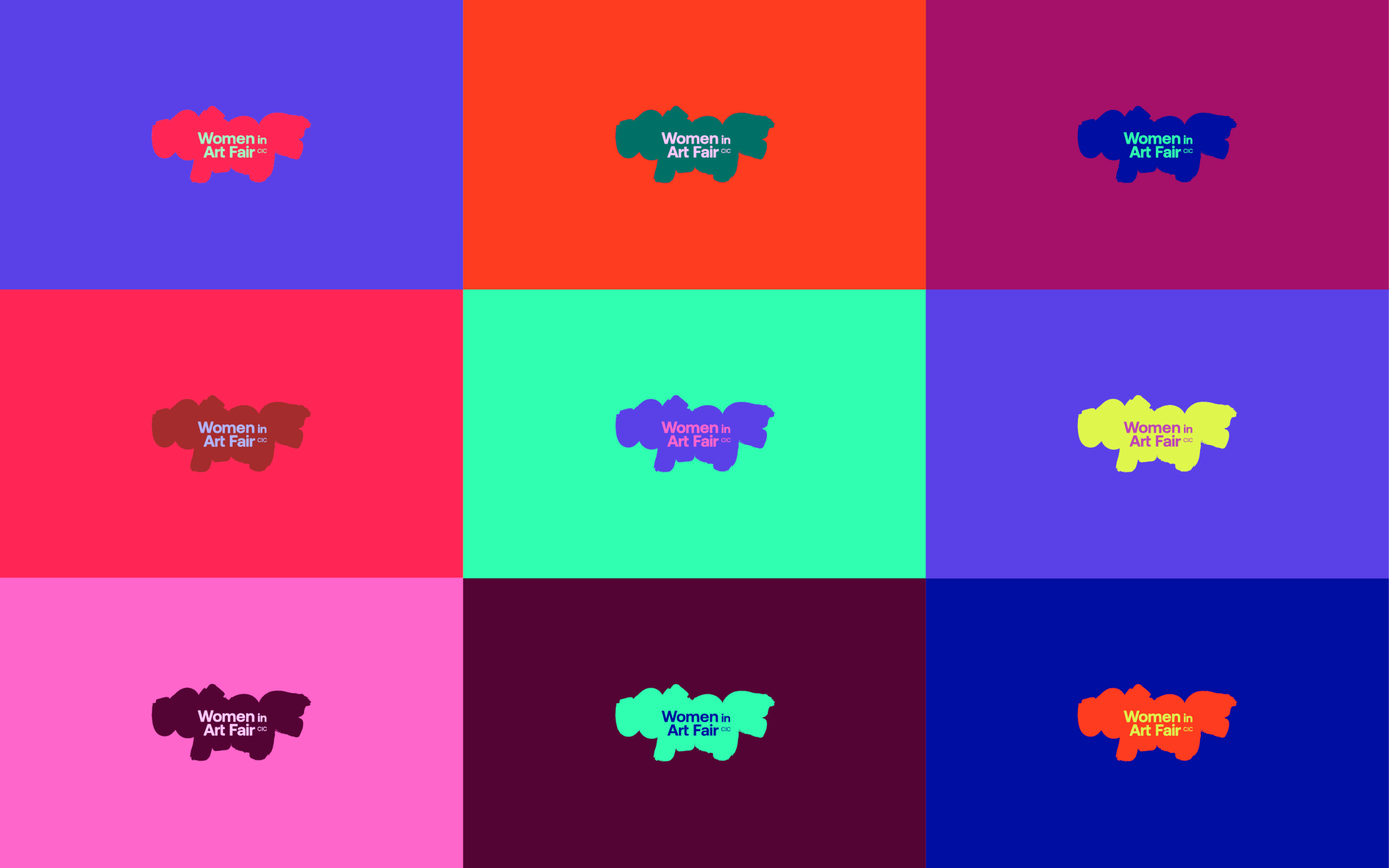
Colour: Championing All Women
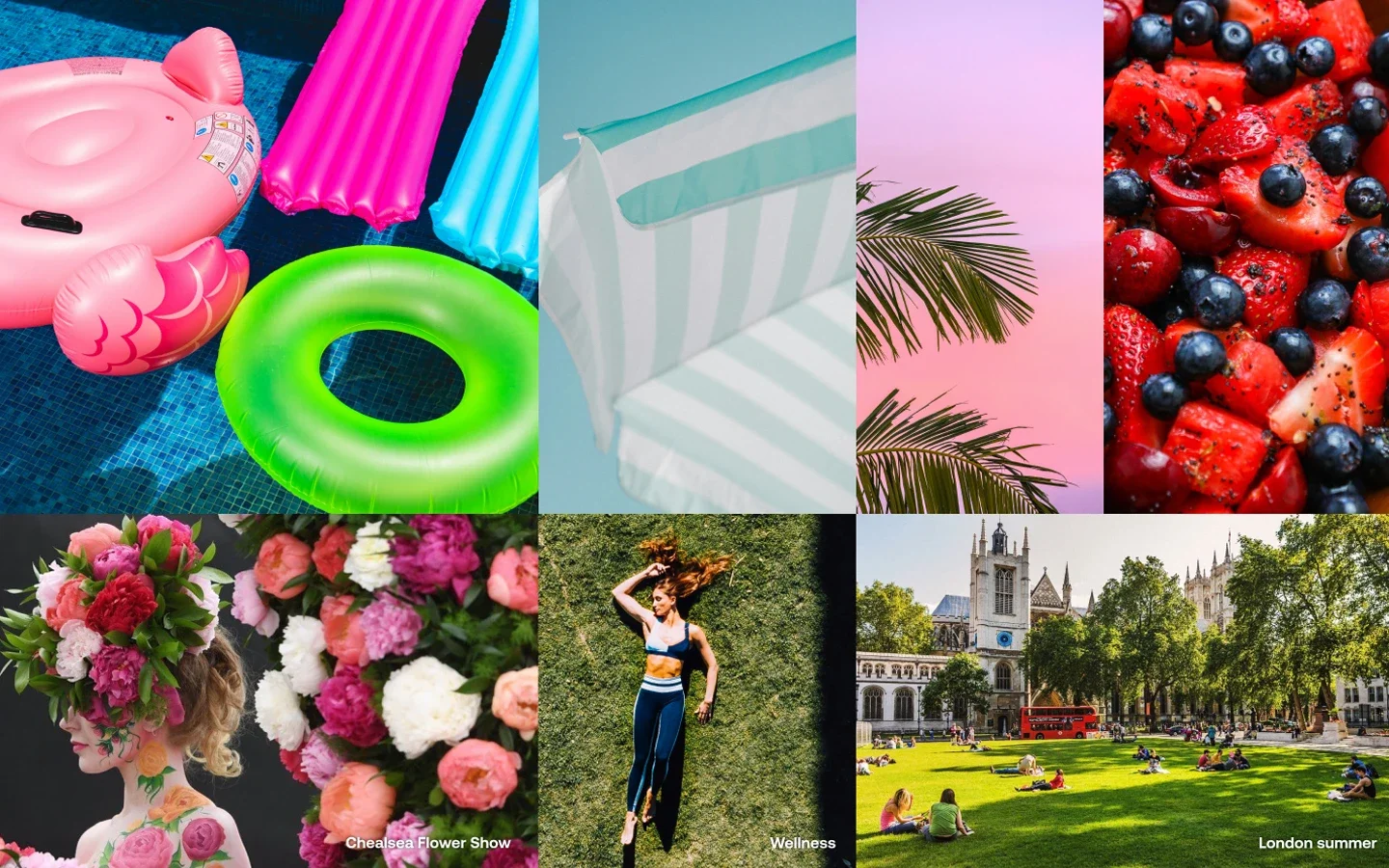
The colour palette is inspired by summer, when the fair takes place: aqua blue, neon green, berry red, sunshine orange, and many more. The vibrant, expansive palette visually represents "all art by all women", celebrating diversity and empowering all women artists.
The system allows colours to clash and combine freely, liberating from old ideas and promoting the new. This flexibility ensures the brand stays fresh over the years while maintaining strong recognition.
Typography: Names that Command Respect
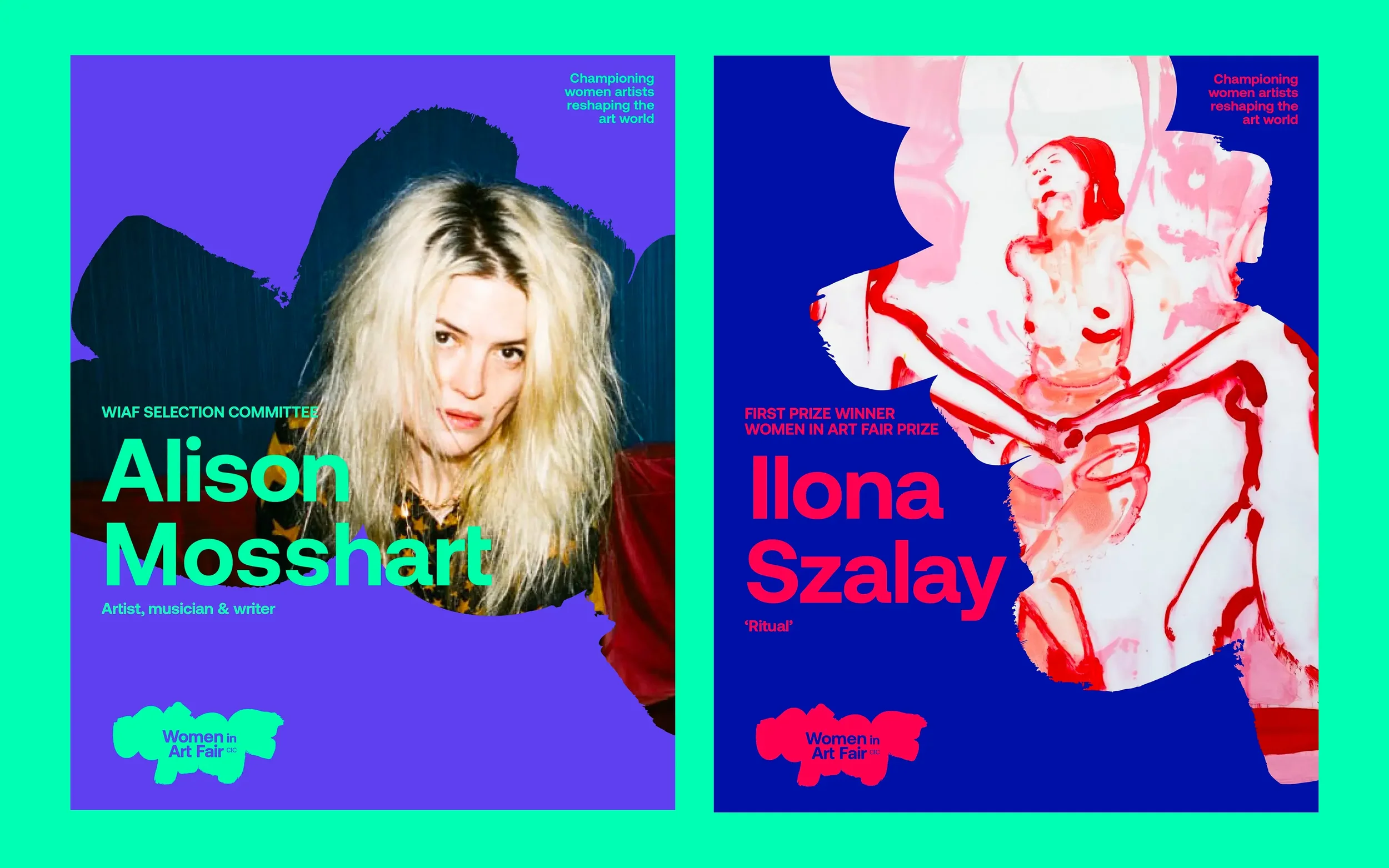
Women's names are set large and proud. Whether you are a rockstar or a rising star who just won our prize, all names are celebrated equally. This typographic treatment is visual allyship—celebrating all creative women with the attention they deserve.
The clean, contemporary sans-serif typography balances the organic brushstroke forms, providing structural authority. Information hierarchies are clear: the artist's name dominates, the fair name supports, practical details inform.
“The new brand gives us an authoritative, approachable new look as we expand from a new face to an established heavyweight on the London art scene.”
— Jacqueline Harvey, Women in Art Fair Director
In a world where gender inequality persists, Women in Art Fair offers something essential: hope, wrapped in joy, backed by defiant determination.
Creative Direction & Design:
June Mineyama-Smithson (MAMIMU)
Client:
Women in Art Fair CIC
Women in Art Fair was founded by Jacqueline Harvey, award-winning businesswoman, Goldsmith alumna, and an wellbeing expert. The fair exists to democratise art, support emerging artists, promote creative health, be inclusive and diverse, and celebrate creativity in women.
Learn more at womeninartfair.com
Can we collaborate on your next branding project?

Photo by Elaine PotterI'm June, a London-based Japanese design consultant who creates visual identities that open doors, attract the right people, and scale your impact. I bring 20+ years of experience from leading branding agencies, with clients like PwC, LVMH, and Cathay Pacific, as well as boutique brands with big ambitions.
Let's talk if you're ready to:
Rebrand to match your growing ambitions
Launch with clarity and confidence
Stand out with authentic differentiation
Build a brand system that works as hard as you do
Get in touch ↓
Fun facts:
I'm also a lecturer at the University of the Arts London, a D&AD Awards Judge and New Blood Jury President, and an exhibiting artist at Kensington + Chelsea Art Week and ING Discerning Eye. My collaboration with neuroscientist Dr Tara Swart resulted in idents for ITV.
Not ready to get in touch?
Join my newsletter to see if we are a good match.